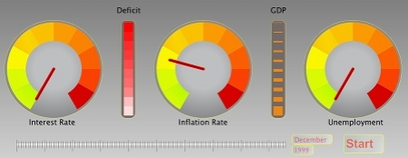
I was recently looking for a new idea to exercise my JavaFX skills, and with the economic wows which have affected so many, I wanted to look at how I could represent the last decade’s economic data WITHOUT box charts, histograms, and line graphs! I decided that a dashboard of the data might prove interesting to create, and could be visually “exciting” (I use the word tentatively with this type of data). I wanted to try and represent this data around, say, an old car dashboard which use to be full of dials and knobs. Unfortunately you can’t tap these dials to get a “better” reading like I use to do all those years ago.
First of, where did I source the data? Well it is all freely available and the first place to look is data.gov.uk. This is an extremely useful resource for all you data junkies and I have been a member from earlier this year (before it was live). It is amazing what data is available here, however I do find it a little cumbersome being directed from one website to another to try and get the data I want and then having to re-issue my query. Thankfully the Guardian have a data blog, where you can source a lot of the data available at data.gov.uk but without having to pull your hair out! I was able to source data from both, thanks 🙂
The data I am representing is: Inflation, Interest and unemployment rates (these are monthly), and then the deficit and GDP for the UK (these are yearly). I decided I would represent the first three with dials which would move to the relevant value as each month passed, and the latter two I would represent with gauges which would move up and down depending on the values.
After some searching for inspiration I found a perfect tutorial from which I could grow my idea. So with the three dials defined and all reading their data independently (each dial is its own task, see my previous post for more info). The two gauges, similar to temperature and fuel, with a pointer moving up and down didn’t have to be set up as tasks, I could define them as triggers which would be actioned each time a year clocked over.
What do think?
I hope you find the data representation and animation an original idea? I have never seen it represented like this before? I am off to source some more recent data…. I won’t pass opinion on the data itself, it is too close to the election to get drawn into that!
